R.I.P. Apple Laptop Touch Bar, We’ll See and Avoid You in Hell
Apple has retired its terrible nightmare touch bar technology, thank god.

As you know, going forward we will only receive increasingly degraded versions of technology that are designed explicitly to make us want to buy the next version, because the current version sucks so intensely. Software updates are also scams. Change is bad, and everyone is trying to steal our money all the time even though we need it. That’s life. But at least we have this: Apple announced on Monday that its new MacBook Pro models would no longer have the touch bar, and will instead have “traditional function keys.”
During Monday’s Apple event, the company also announced other things — AirPods with spatial audio, a return to the magnetic charger that allowed people to trip over your charging cord without making your laptop crash into the ground. But the thing we’re focusing on here is the touch bar. Listening to complaints from “programmers” among others (everyone), Apple is getting rid of it.
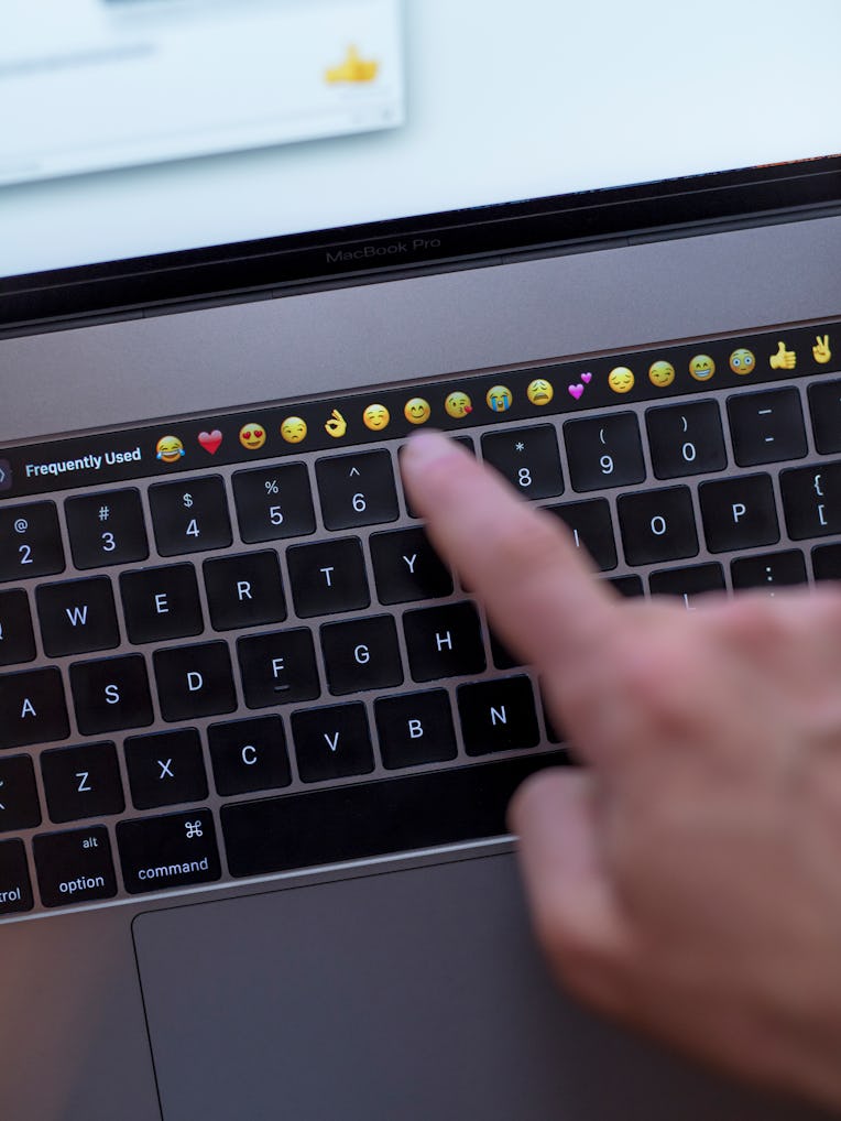
I currently own a Bustle Digital Group-provided MacBook Pro featuring the dreaded touch bar, which I hate. It sits just above the number keys on the keyboard, and accidentally touching it while I type fucks up my life on a regular basis. It refreshes and goes backward and forward between windows unintentionally, it adds emojis when emojis were unwanted, it behaves generally as if a small demon were embedded within my laptop and his only purpose in life was to annoy me.
The touch bar is, I suppose, meant to give you the opportunity to use your pointer finger to do things such as navigate your cursor to the URL bar or add emojis (these seem to be its two main functions) rather than use your thumb (or pointer or middle finger) to do so on the touchpad. Use of the touch bar demands you keep your eyes on the touch bar, rather than on the screen. The touchpad is, alternatively, an asset users already know how to … um, use, while simultaneously looking at what they are doing on their screen. The touch bar is a fucking useless piece of shit that is annoying and I hate it.
Also on the touch bar: The volume and brightness keys. Before, the volume and brightness keys were keys. You could tap them for your desired volume and brightness. Now, you tap on either volume or brightness and then you use your finger to drag it to the appropriate setting, because someone at Apple thought this would make users feel like they were in the Jetsons even though it is functionally much more difficult and sucks.
The one thing I will give the touch bar is that when you’re on a Zoom call, it displays on its stupid little screen the button that allows you to leave the call. This is, I admit, easier than finding that button within the Zoom window. This, while helpful in a very small way, was obviously not enough to justify the demonically useless existence of the touch bar.
Can I tell you a story? It’s long and essentially unrelated. At one point during my tenure at another media company, the building that housed its offices decided to replace the functional push buttons on its elevators with sometimes-functional touch screens. When you scanned into the lobby with your ID card, the scanner — assuming your destination — would display the letter and number of an elevator, directing you to the elevator that was arriving to take you to that destination. If you were unable to find the correct elevator in time, or wanted to stop on the floor that had the coffee shop before going to the office, you had to press the floor number on the touch screen, and it would direct you to the appropriate elevator.
This is a system that is meant to better direct traffic in skyscrapers. This building had seven floors. On top of the touch screens’ obvious uselessness that betrayed the fact that some monorail-ass elevator huckster had incorrectly convinced the building’s owner of its supposed necessity, they barely worked. Elevators would not arrive. People would get on elevators and find multiple floors that were not their floor were illuminated, and had no recourse but to stop at each of those floors, hoping their floor would be next. (It sometimes would be.) People got stuck within the elevators on multiple occasions. The whole while, the formerly useful buttons were sitting there, within and outside of the elevators, with unsightly tape over their beautiful button faces.
The moral of the story is: Let us have buttons. We want buttons. Buttons work. And please, for the love of god, bring back the button on the iPhone.